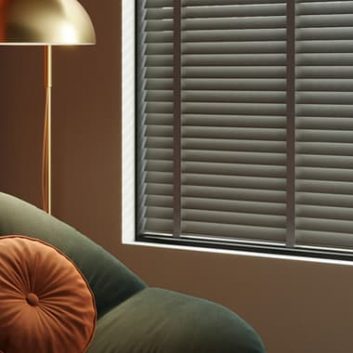
If pressed to identify a colour that summarised 2020, I think I’d go with that horrible cow-diarrhoea greenish-brown shade that cigarette packets come in now. This was apparently chosen for cigarette packets specifically because it was voted by focus groups as comprehensively the most repellent colour known to man.
Trying to identify the hot colours of 2021 is something of a bold move then, given that we don’t know with any certainty if 2021 is going to be the year of free love and parties that we were all given to believe last year, or if it’s just going to be more of the same empty promises and work-from-home disillusionment.
I also think that when it comes to making major moves to redecorate your home like investing in a new three-piece suite or painting a room, fad colours are not the way to go.
I mean, millennial pink from a couple of years ago, where is it now? If your answer to this is “on 75% of the walls in my house,” thoughts and prayers babe, good luck with that. Perfectly nice colour, but there’s a reason that the periodical claims like “brown is the new black” and so on don’t stick; because there are some colours that endure and some that very much do not, albeit they’re nice enough or wildly popular for a short time.
With that said, when it comes to smaller/cheaper/more transient accessories or interiors elements that don’t represent such a huge commitment of money and design aesthetic, I am all about switching things up on the regular.
It’s funny too how you can come around to a colour if you see it enough; like that flat dark-ish cement grey shade that suddenly started appearing on cars a couple of years ago, my initial response to this shade was “why would you do this to yourself,” but now I think it’s kind of smart…
Anyway, I’ve had a quick scope of what the design mags, Pantone, and stylists seem to be leaning into over the last couple of months, then thrown out any limbs stood on by them who seem to be taking themselves a bit too seriously, or that appear to think everyone does a £10k redecorate on an 18-month cycle. Here then are the two main players I’ve come up with…
The hot and the not, in my very personal opinion, but if my “hate” is your “love,” I have just the Marmite blinds for you too.
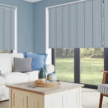
Hot: Dark, deep teal-meets-navy-blue (with bronze accents)
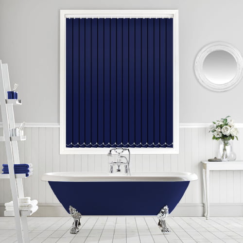
The dark, deep teal-meets-navy shade I’ve gone with here is hard to describe other than as stated; no least because both teal and navy blue itself, which should be two of the most reliable of colours and that literally have their own colour codes to define them, seems to mean different things to different people.
Mix the two then and you get something with hella depth and fluidity to it that I really love; so much so in fact that a blind in this shade is the latest addition to my bathroom.*
That said, I have only gone one-blind-in for this rather than doing a whole room as I also think it’s soon going to shake its way down to the high street in the most cheap and nasty way possible, accompanied by lots of gilt and gold (which it really does pair well with; I fully considered painting my bathroom ceiling in the same shade and then flicking a load of bronzy paint at it for stars). Too much like hard work was part of my reluctance, and also I seriously feel that the inevitable plastic trays and accessories in this shade that Homesense is going to be full of by September might ruin the whole opulence of the thing that its appeal largely hinges on for me.
So this shade is a “yes” for me, but in a kind of pre-emptive “I liked its earlier work but now it’s just too commercialised and mainstream, yuck” way.
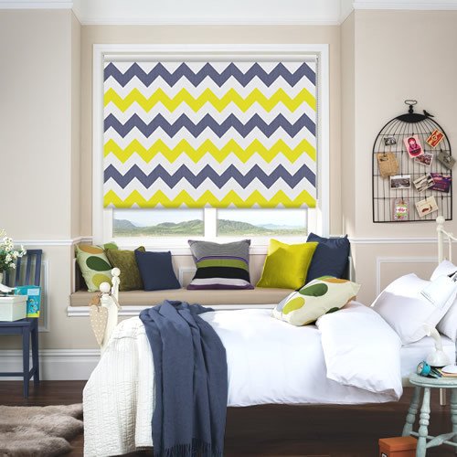
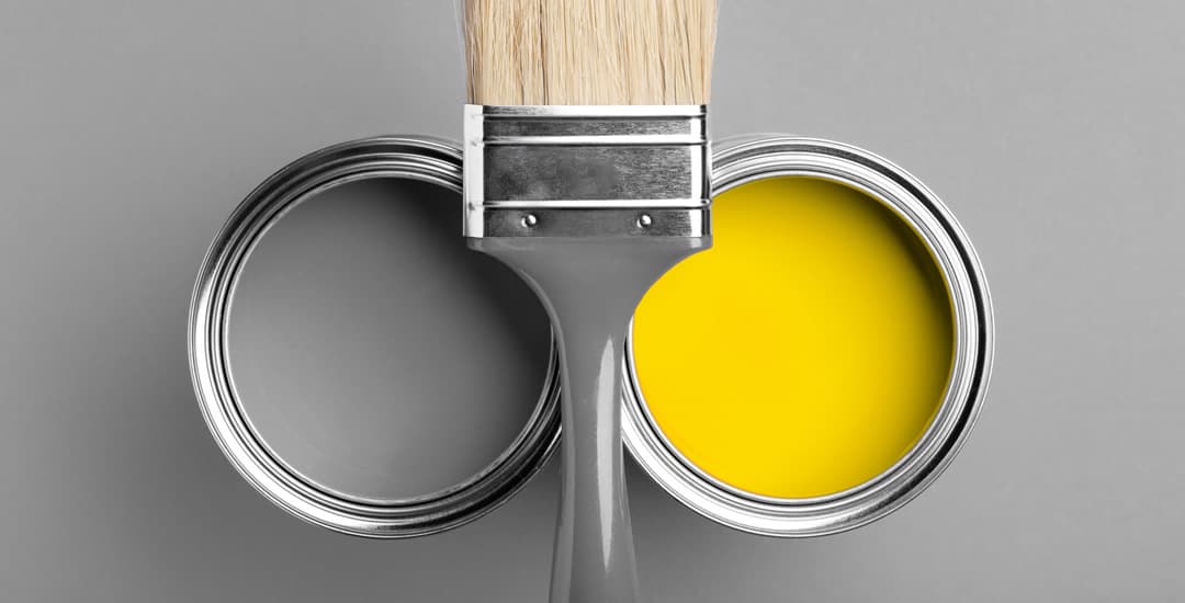
Not: Anaemic bumblebee, a.k.a. Pantone’s colours of the year 2021
I mean, they’re not calling it “anaemic bumblebee,” but when you pair a vibrant but not orangey yellow shade with a flat medium-hued grey, this is IMO what you get. It’s… An interesting choice for me, because I cannot imagine its theoretical applications or a high degree of uptake in and of itself other than for the sake of fashion.
The exact shades in play here are “Illuminating” (PANTONE 13-0647) and “Ultimate Grey” (PANTONE 17-5104) which Pantone tells us demonstrate “strength and positivity” and “practical and rock solid” respectively, and which they feel “express the mood for 2021.”
I don’t even know where to start with unpicking this one, but I’m not sure that the national mood three months into 2021 can be summarised by strength, positivity, practicality and reliability; the four words I would pick all incidentally have four letters too, so perhaps it’s best I leave it there.
Thing is, while I’m not into yellow as a shade for myself (it does something horrific to my skin tone, somehow managing to make me look both florid and green all at the same time) I can appreciate it; and having been conditioned by a few years’ worth of “grey is no longer just for cement and John Major,” I could possibly raise a lukewarm enthusiasm for the grey too.
But put them together and I’m just… I can’t make it happen, I really can’t. Anaemic Bumblebee, the Pantone colours of 2021. That’s all I’ve got.
