If you choose blinds for your room, the blinds themselves (particularly when closed) take up a reasonable amount of visual real estate, which means that ordering blinds and then finding that you don’t like the look you’ve achieved is an expensive mistake to make!
When it comes to choosing blinds based on their aesthetics rather than functional considerations, there really is no right or wrong, nor a defining style guide that can tell you what looks good and what looks bad in all situations, other than in the personal opinion of the guide’s writer.
However, one of the most common questions I get from would-be blinds buyers is “should blinds be lighter or darker than walls,” as well as queries as to whether blinds should in fact match the walls exactly or as closely as possible instead.
Personally I hate fielding enquiries of this type, because I cannot decide for someone else what will look good in their home, nor know how much they’re going to like the finished effect of a suggestion I make.
With all of that said though, there are a few pieces of accepted wisdom regarding choosing the colour of your blinds compared to the colour of your walls, as well as some tips and pointers that can potentially help you to make the right choice.
This blog post will ask “should blinds be lighter or darker than walls” and why, as well as “should blinds be the same colour as walls” instead.
Should blinds be the same colour as walls?
They can be if you want them to be; having blinds the same colour as the walls creates the most seamless transition between blind and wall, and while the effect isn’t going to be absolute, it gives more of an impression of one continuous space when the blinds are closed, which can make the wall in question look longer/larger.
However, if the blind/window is large and the rest of the wall it is on is broken up by artwork or other visual elements that draw the eye, the large, blank closed blind in the middle of the space can look a little empty or odd.
This is not an issue if your walls are largely bare in keeping with a minimalistic theme, but if that’s not what you’re going for, do bear this in mind as a potential downside of matching your blinds to your walls.
Should blinds be lighter or darker than walls: what you need to know to decide
If you’ve ruled out the “same colour as the walls” option and now need to decide if you want blinds that are lighter or darker than your walls, here are a few things to consider in terms of what sort of effect different choices will result in.
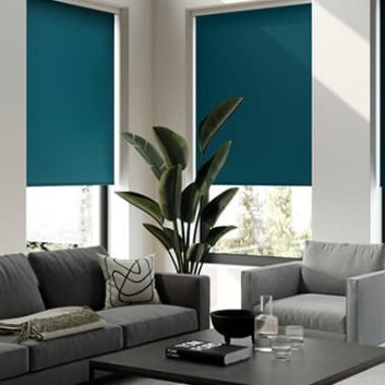
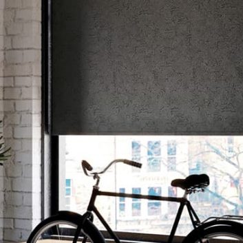
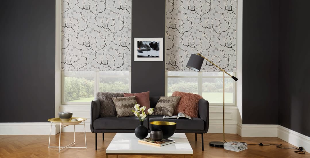
- If you choose blinds that are darker than the walls around them, this usually gives the blinds more visual impact; they can literally appear to take up more space, and draw the eye and cause it to linger longer. With that said, if you have very dark walls and a very light blind, the degree of contrast between them will potentially cause a heightened impact of its own, kind of like the negative effect in photographs.
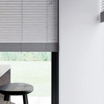
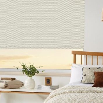
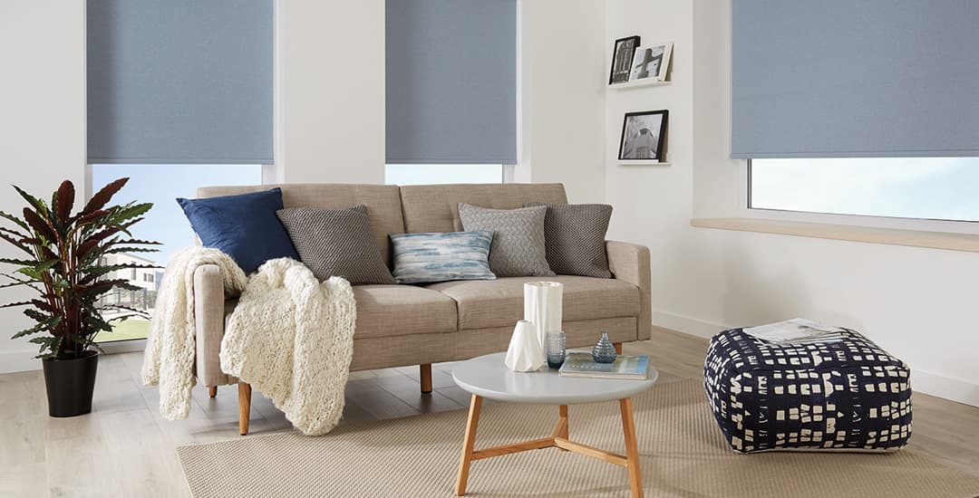
- Choosing lighter blinds than the walls, on the other hand, tends to cause them to blend in more and feel rather more subtle; the eye skims over them rather than pausing on them.
- Having darker coloured blinds can add warmth and intimacy to larger rooms or longer walls, as it breaks them up a little and adds engagement. It can be a little overwhelming for smaller rooms or rooms with a lot of stuff in them, however, and make them feel even smaller than they actually are!
- Again on the flip side, if you use lighter coloured blinds compared to the wall colour, this can make the room feel a little brighter, larger, and more airy when the blinds are closed, which is often the right approach for a small room. This does work well in many larger spaces too, and can make them seem even bigger than they are if that’s what you’re after; but it can potentially make them feel a little cold or empty instead in some cases.
A better question than “should blinds be lighter or darker than walls” is…
Finally, while “there is no right or wrong when it comes to what you like and don’t like in interiors” is probably going to end up engraved on my headstone, there is one thing I want to mention in terms of colour choices as they relate to the junction between blind and wall/room:
A better question than “should blinds be lighter or darker than walls” is “should blinds have the same tone as the walls.” By “tone” I mean warmth or coolness respectively; for instance, a shade of blue, red, or any other colour you care to name can be either cool toned or warm toned.
The colour of your walls has a tone too, even if your walls are a neutral colour; and this tone conveys a theme and feeling that is best matched and complemented by the other things in the room singing from the same tonal hymn sheet!
For instance, a room might encompass several colours across different features (like the walls, furnishings, and blinds) but in order to avoid it looking and feeling jarring, this would be best served by ensuring that all of the key colours are either warm or cool toned respectively.
All of this ultimately means that whatever choice you make in terms of your window blinds being lighter or darker than your walls and by how much, you really “should” match blinds to walls in tone, whether that tone be cool or warm.
Comments or opinions?
If you think I’ve missed something out that would be helpful to someone tackling the “should blinds be lighter or darker than the walls” question, please leave me a comment. I’d also be interested to see your own examples of your choices and your thoughts on how well they worked compared to what you were hoping to achieve!

